


In today’s digital world, users access websites from a wide range of devices- smartphones, tablets, laptops, and large desktop monitors. This diversity means that a one-size-fits-all website layout no longer works. That’s where Responsive Web Design (RWD) comes in to play.
What is responsive web design?
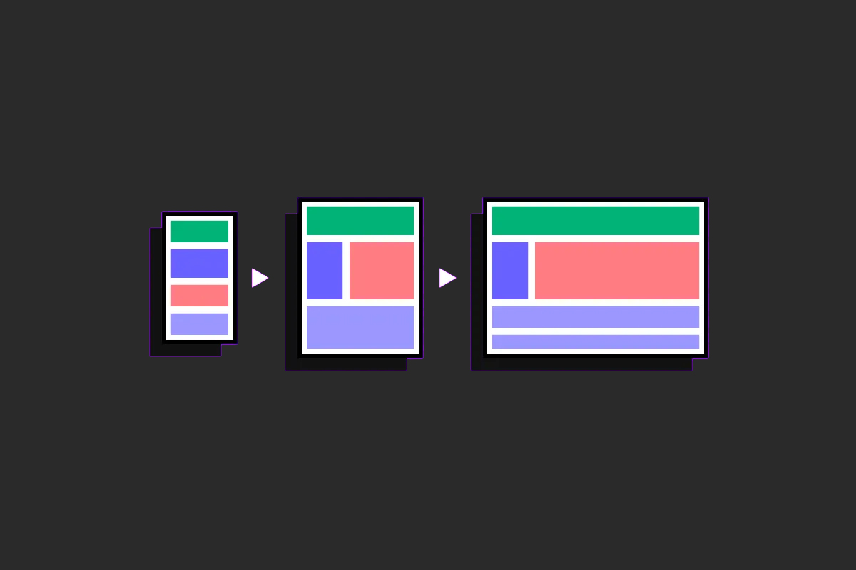
Responsive web design is a web development approach that allows a website to automatically adjust its layout, content, and elements to fit any screen size or device, whether it’s a desktop, tablet, or smartphone. It ensures that users have a consistent and user-friendly experience across all devices without needing separate versions of the site.
Why is responsive design important?
- Increased Mobile Usage- More than half of web traffic now comes from mobile devices. If your website doesn’t work properly on a phone, users are likely to leave.
- Improves User Experience- In a responsive website, it is easy to navigate and read on any screen size. It prevents the need for zooming, scrolling sideways, or struggling with tiny buttons.
- Boosts SEO (Search Engine Optimisation)- Google prefers responsive websites. A responsive design can help improve your ranking in search results, bringing more visitors to your site easily.
- Cost and Time Efficient- Instead of building separate systems for mobile and desktop, you need to implement a one website and make it responsive. It saves time and cost.
- Adapts to All Devices- With new devices emerging every day, this ensures that the system works well on all devices without any concern.
Core principles of responsive design
Responsive web design is based on a few fundamental principles that ensure a website looks good and functions well across all devices. Here are the key points:
- Flexible Layouts- The website layout should adapt to different screen sizes. Rather than using fixed widths, elements should resize according to the device.
- Media Queries- These are styles in your website’s stylesheet that help your design look great on different devices. They make it easy to customise the layout for mobile, tablet, and desktop screens, ensuring a smooth and friendly experience for all users.
- Scalable Images and Videos- Visual content like images and videos should automatically resize to fit the screen without stretching, overlapping, or breaking the layout.
- Responsive Typography- Font sizes should scale smoothly for readability on all devices. Text should not be too small on phones or overly large on desktops.
- Touch-Friendly Design- Interactive elements like buttons and links should be large enough and spaced well for easy tapping on touchscreens.
Tools help you to implement responsive design
To make responsive design easier and more effective, here are the most widely used tools trusted by developers and designers:
- Bootstrap- Bootstrap is a free tool that helps you build websites that work well on all screen sizes. It comes with a layout system and pre-designed elements like buttons and menus that adjust automatically to fit any device.
- Tailwind CSS- Tailwind is a modern tool that lets you style your website by adding simple classes directly to your HTML. It gives you full control over how your site looks and makes it easy to create custom designs that work on any screen.
- Figma- Figma is a design tool used to plan how your website will look. You can create and test your design for different devices before you start building the actual site. It’s easy to use and works right in your browser.
- Chrome DevTools- This is built into the Google Chrome browser. It allows you to see how your website appears on phones, tablets, and computers. You can test your design and fix any problems right from your browser.
- Google Mobile-Friendly Test- This free tool from Google checks if your website is easy to use on mobile devices. It shows you what works well and what needs fixing to improve the mobile experience.
Best Practices for Responsive Web Design
Creating a responsive website isn’t just about making things fit on smaller screens, it’s about delivering a smooth and consistent experience across all devices. Whether you’re a beginner or just brushing up, here are some best practices to keep in mind:
- Start with Mobile First- Begin your design with small screens in mind. This helps you focus on the most important content and ensures your website is usable even on the smallest devices. Once the mobile layout is working well, you can scale it up for larger screens.
- Use a Flexible Layout- Instead of fixed sizes, use flexible grids and containers that automatically adjust based on the screen size. This helps your layout look balanced, whether it’s on a phone or a desktop monitor.
- Set Clear Breakpoints- Breakpoints are points where your website’s layout changes to better fit the screen. Choose a few key breakpoints, typically for mobile, tablet, and desktop, to keep things clean and consistent.
- Optimise Your Images- Images should be resized to fit the screen without losing quality. Also, compress them to reduce load times, especially important for users on mobile networks.
- Simplify Navigation- Navigation should be easy to use on all devices. On mobile, consider using a hamburger menu or collapsible navigation to save space and keep things tidy.
- Make Text Easy to Read- Use font sizes that scale well on different screens. Make sure there’s enough space between lines and elements so the content doesn’t feel cramped, especially on smaller devices.
- Avoid Fixed-Width Elements- Fixed- width containers can break layouts on smaller screens. Instead, use percentage-based widths or other flexible sizing to allow elements to adjust smoothly.
- Test Across Real Devices- Don’t just rely on browser tools. Check your website on actual phones, tablets, and laptops to see how it performs in real- world situations. This helps you catch layout issues early.
Common mistakes to avoid in responsive Web Design
- Using Fixed Width Layouts- One of the biggest mistakes is using fixed pixel sizes for containers or elements. These don’t adjust to different screens, which can break your layout on smaller devices.
- Ignoring Mobile Users- Some designers focus only on how the website looks on desktops. But today, most users visit websites from their phones, so always design with mobile users in mind.
- Overloading the Page with Content- Trying to fit too much on a small screen can overwhelm users. Keep your layout clean, prioritise important content, and use white space wisely.
- Poor Navigation on Mobile- Menus that are hard to tap or too small on phones can frustrate users. Always make sure navigation is easy to use on touch screens.
- Not Testing on Real Devices- Relying only on browser tools isn’t enough. A design might look fine on your computer, but behave differently on an actual phone or tablet. Always test on real devices when possible.
- Unoptimized Images- Large, high-resolution images can slow down your site, especially on mobile networks. Make sure your images resize properly and are compressed for fast loading.
- Overusing Breakpoints- Adding too many breakpoints can make your CSS hard to manage. Instead, choose a few key screen sizes and let your layout adapt naturally in between them.
Final Thoughts
Responsive web design is no longer optional- it’s essential. As users continue to browse the web on a variety of devices, creating websites that look good and work well on every screen size is key to delivering a great experience. By using the right tools, following best practices, and avoiding common mistakes, you can build websites that are fast, flexible, and future-ready. Start small, keep learning, and always test your designs on real devices.